Research Into Fashion Videos on YouTube
It was important to do some research on videos with a style similar to the one of our live show. YouTube is probably the best place to start research as it has a market of a lot of people making videos with a similar budget to the one we will be working with on this project.
I wanted to look into people who made consistent fashion videos on YouTube and see if they followed a certain style or theme throughout their videos.
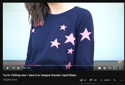
After doing a bit of research into Fashion YouTubers, I came up with a case study. I found a channel by Ingrid Nilsen. She has 3.8 Million Subscribers and averages 1.4 Million views per month. Her channel is focused on Fashion and Beauty but does merge into other genres with more chatty videos.
(Ingrid Nilsen YouTube Channel, 2018)
I noticed that her channel art is minimalist, it is right to the point and does not have any more than needed. I think this works well, as the Channel name is her name I don't think you really need any more. While I assume Simon will adapt what Melissa and Katie have previously done, I think that the logo they have created already works well with the theme of most fashion bloggers. It is minimalist but with subtle accents to make it a unique brand. From my research into similar videos so far, it seems that a logo/theme that is to the point is more important than a flashy logo with multiple dimensions to it.

As for Ingrid Nilsen's videos, they follow a similar theme to her branding. The videos themselves are edited in a minimalist way but with editing makes it interesting for the viewer. For example, the quadruple screen part where she shows all the outfits that will be included in the video. This is a way of letting the viewer know "whats to come" in this certain video. The videos also generally include a backing track which is upbeat to keep with the light-hearted theme of the video.
As for the main portion of the video, it followed a similar theme for each outfit.
It would start out with a piece to camera talking about the item and then merge into a shot of the outfit and the costs. This once again was done in a minimalist way. Apart from Ingrid in the shot, there is only ever the text with the prices. This may seem like it "has little production quality" to some, however, I think this works well in videos like this as we do not need any more information than this, so why show it? Once the price info is on screen, it cuts to a few detail shots of the clothes so the viewer can see in higher detail the quality and "feel" of the products.
There also has been thought into the cinematography in this piece. For the main PTC, it has a nice simplistic background with a "cosy" and "personal" feel to it. I think it is designed to make the viewer connect with Ingrid as much as possible. Looking through multiple different videos of hers, she always has a relaxed personality and one that will keep her regular videos at ease because you know what to expect.

The lighting and cinematography work well on her outside shots. There is evident planning into where it will be shot as the lighting is good and the background is white so the price infographics would work well in opposition to the backdrop. As I will be operating the camera on one set of the VT's it will be important to look at locations beforehand, so I will be able to plan what equipment will be needed. Example: If were we are planning to shoot in a place that could be light/dark depending on weather (eg. Looking through the wardrobe of a blogger segment [4]) I would need to plan to bring adequate lighting.
Even outside her videos, Ingrid follows her "theme" into her Thumbnails and social media. While each thumbnail seems to have a different colour, it has a similar pattern of around 1/3 of the screen covered by a colour triangle which includes relevant text to the video.
While I will not be apart of the branding in any way, I think it is important to realise that a lot of Fashion YouTubers follow a theme over all platforms. This will mean that we will have to all work together closely to make sure that the theme and style are consistent throughout all social media and our final piece.
Through this research into Ingrid Nilsen, I think the biggest thing that I realised that it will be very important to follow a particular "style" throughout the whole show. This means that the whole show including VT's will need to be directed and produced in a way that all "parts" will work in harmony. I don't think this will be much of an issue, however, as we have producers who really know the genre and will have a great idea of how they want the show to run including the theme.
I also noted that a lot of Ingrid's videos have a similar colour pallet, I'm sure more research will be done into this but if we follow a similar colour pallet it may help with the continuity.
Looking into TV Shows & Role Requirements
I had worked as a camera operator on all of the units in some way so far at university, but I wanted to look specifically into camera operations for the Fashion/Beauty genre.
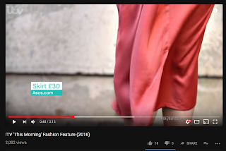
I found a piece that was on ITV's This Morning show.
(ITV This Morning Fashion Segment, 2018 ) Strangely this followed a lot of the concepts that I found in Ingrid Nilsen's posts. They had the pop-up with the details and also wide angle shots mixed with close-ups of the items. I think this has shown, no matter the budget, that we should always aim to get as many different types of shots for the same product.
As for the camerawork itself, it wasn't that complicated. It was mostly a static camera with the model walking into shot and creating movement in the shot in that way. of course not all the segments would be like this, however, it was interesting to note that in both of the scenarios that I have seen so far the camera is static. We could also make the shot interesting by using some pull focus shots and we could experiment with slight movement before the shot focuses on the main subject.
Ideas for VT Segments
I don't really have any experience in this genre, but I have come up with a few ideas that could possibly work with this project.
- Something popular on YouTube is "challenge" type videos that I think could work well in this show, however, I am not sure what segment it would work well in.
However, the general idea was giving the two presenters a budget (eg. £25) to go out and find some unique items, maybe a full outfit? This would be a way to mix some of the ideals that are popular into a VT in the show. I do not know what segment this would work well in, however, it could work in the "Very vintage" segment if it was changed to going to a market or charity shop to find cheap items for an outfit.
- For the "Not on the high street" segment, we could have something with the presenters finding unique outfits from online blogs and then sourcing something similar & buying them. Then explaining why they may interest the viewer. It would be a way of showing people how to style clothes that they have taken inspiration from online sources.
Sources
Ingrid Nilsen YouTube Channel, 2018
Accessed on 29th January 2018
ITV This Morning Fashion Segment, 2018
Accessed on 29th January 2018


